Inside our bold brand refresh.
At Sweepsouth, we believe in more than just evolution – for us, it’s about embracing change with a fresh, bold identity that reflects our growth, our values, and our ambitions.
Throughout the last 18 months, we’ve been on a journey, not just to refresh our look, but to refine how we show up in the world, and how we stand out within our competitive landscape while staying true to our African roots.
Our decision to refresh our brand was fueled by the desire to move away from a clean, clinical image into a brand that feels authentic, vibrant, and bold. As we expand our platform and services, we want our identity to reflect the personality and joy we bring to our customers’ lives. This refresh is about welcoming more life and colour into our visual identity – it’s about making sure our brand feels like home while remaining unmistakable South African.
The heart of our refresh: Our logo.
Our new logo is at the heart of this refresh. Featuring a sun rising over a house, it symbolises the joy and happiness we bring to our customers while paying homage to our heritage. The sun is a universal symbol of hope, courage and new beginnings, and for us, it represents our mission to bring a brighter future to the domestic services industry.
The home is central to everything we do, and our new logo mark reflects our commitment to making homes feel warm, welcoming, and clean. Our choice of colours is just as deliberate: orange symbolises warmth and energy, while pink evokes tenderness and care. Together, they represent our core value of spreading the joy that comes with a well-looked-after home.
Colour and imagery: Sparking joy.
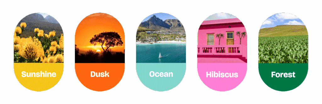
Our colour palette is inspired by the rich landscapes, vibrant colour and diverse beauty of South Africa. We’ve chosen hues that evoke positive feelings as a move away from the more neutral tones we’re used to. These colours aren’t just about standing out from the crowd (although that is a bonus), they’re about reflecting the warmth and life we carry. We are now more than just a cleaning platform; it’s a source of happiness and positivity, and our colour choices express that.
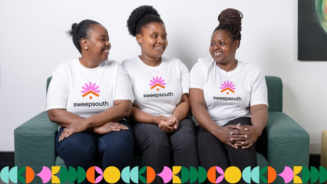
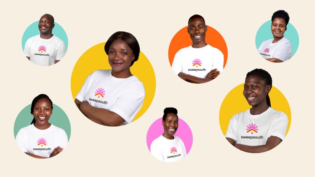
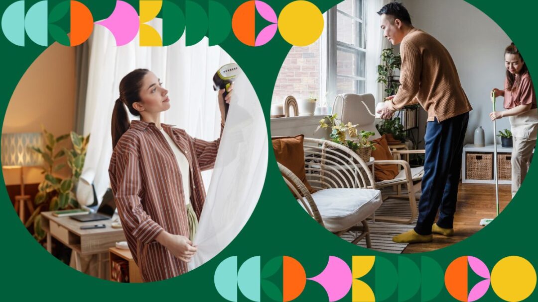
Alongside our new colour palette, we’ve embraced the use of real, relatable photography that brings more humanity into our brand. The images we use are of real people – our staff and the SweepStars who are the heartbeat of our business. This decision isn’t just about aesthetics; it’s about telling the story of the people who make Sweepsouth what it is. Our brand is about connection, and that connection is brought to life through the faces and experiences of the people behind our services.
The pattern: A symbol of unity and connection.
Our new circular graphic pattern draws on our South African heritage and the universal symbolism of the circle. In South Africa, the circle is a symbol of community – from the traditional rondavels that dot our rural landscapes to communal imbizos* that emphasise unity. Universally, the circle represents wholeness, connection, and the cycle of life. For Sweepsouth, the circle speaks to our ethos of community, and it’s a versatile shape that can be used in many ways to add personality and depth to our brand.
This pattern isn’t just a design choice; it’s a reflection of who we are as a brand. We’re colourful, bright, and interconnected, and the circular graphic allows us to express that in a way that feels authentic and rooted in our values.

Our brand persona: Goodness to the core.
Our new brand persona is all about being good – good for your home, good for SweepStars, and good for our community. We’ve always strived to be trustworthy, caring, and authentic, and our rebrand reinforces these values. Our brand voice, “FeelGood™,” encapsulates everything we stand for. We’re here to bring joy and positivity into people’s lives, whether it’s through a sparkling clean home or the dignified work opportunities we provide.
For us, this brand refresh isn’t just about looking different – it’s about feeling different. It’s about capturing the essence of what Sweepsouth is all about: making life easier, brighter, and more joyful for everyone involved.
From our new logo to our updated colour palette and graphic elements, every part of our brand refresh tells the story of who we are and where we’re going. We’re excited to continue our journey with a renewed sense of purpose and a brand identity that truly reflects the joy we seek to spread, one clean home at a time.
*imbizo: IsiXhosa word that translates to “a gathering to share knowledge”.